Eduonix
Redesigned the mobile learning experience to improve engagement and course accessibility
1. Overview
Eduonix is an online learning platform offering technical and professional courses. The existing mobile experience lacked visual consistency and felt outdated compared to competitors.
This project focused on modernizing the UI while introducing targeted UX improvements to enhance usability and perceived product quality.
2. Problem
Outdated UI reduced trust and perceived product quality
Limited functionality (e.g. no offline learning support)
Poor usability due to cluttered structure and inconsistencies
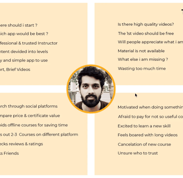
4. Research Insights
Users prefer mobile-first learning with quick, structured content
Strong need for trust signals (reviews, certification, value clarity)
High sensitivity to pricing and perceived course quality
Role: UX/UI Designer
Scope: Research, Visual Design
Duration: 6 weeks
Tools: Figma, Photoshop, Illustrator
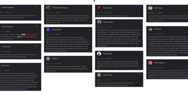
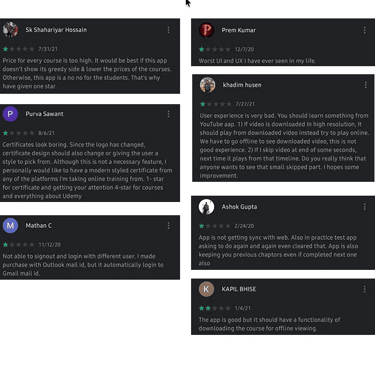
User Reviews
Click on the images to enlarge
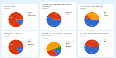
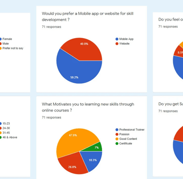
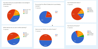
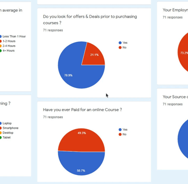
Survey
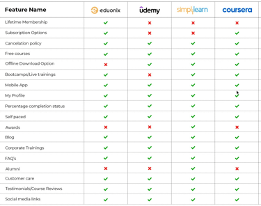
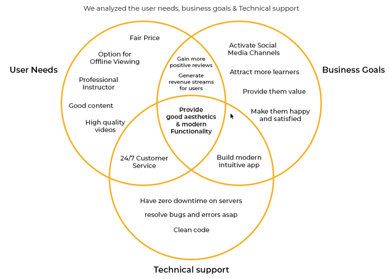
5. Competitive Analysis
Competitors offered stronger feature sets (offline, credibility, UX polish)
Eduonix had pricing advantage but weaker experience
Opportunity to position as affordable yet high-quality platform
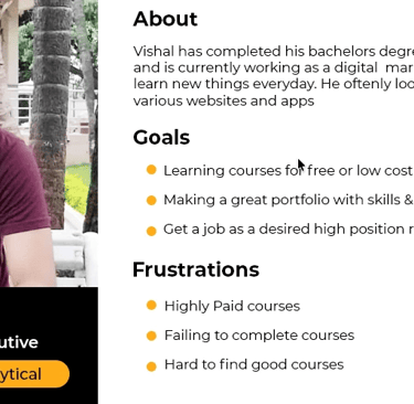
6. User Understanding
Goal-driven learners seeking career-relevant skills
Need clarity, speed, and confidence before purchasing
Avoid platforms that feel confusing or low-quality

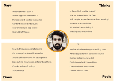
7. Key Insights
Clarity → Users need simple navigation and structured content
Trust → Certifications, reviews, and transparency drive decisions
Flexibility → Offline access and self-paced learning are critical
8. Design Approach
Built a clean and consistent visual system with improved hierarchy
Introduced dark UI to support content-focused learning experience
Improved course discovery through navigation, categories, and search
Enhanced decision-making with structured content and pricing clarity
Reduced onboarding friction with simplified authentication flows
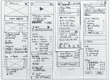
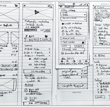
9. Wireframes
Explored layout structure and content hierarchy
Defined key flows (browse, course detail, checkout)
Focused on simplifying navigation and interactions
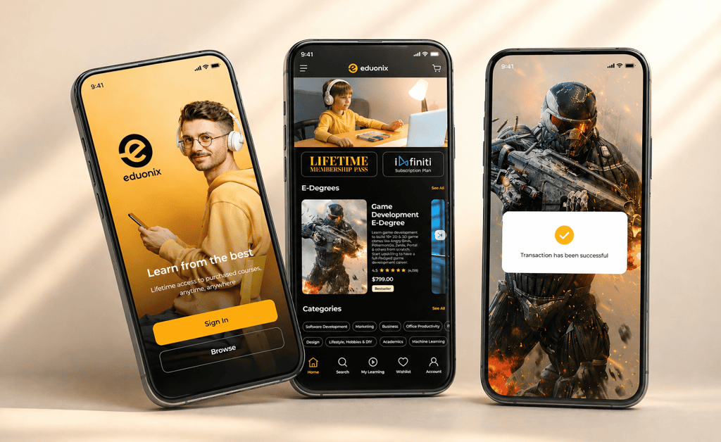
10. Final Design
Modern, consistent UI with strong visual hierarchy
Improved onboarding and course discovery experience
Clear presentation of course value and information
11. Impact
Improved visual consistency across the product
Enhanced usability of key flows and navigation
Increased perceived trust and product quality
12. Conclusion
The redesign transformed Eduonix into a more modern and structured learning experience by combining visual clarity with focused UX improvements.
The updated design aligns better with user expectations and industry standards in the eLearning space.
Designed with a strong focus on usability, hierarchy, and intuitive user experience.
The project highlights structured problem-solving, product thinking, and modern interface design principles.
Additional opportunities for refinement and future enhancements were identified within the project scope.
Design that speaks. Experiences that convert.
© 2026 Pranav Designs - Crafted for clarity
Let’s collaborate → hello@pranavdesigns.com