TutorialsPoint
Modernized an outdated eLearning experience through visual clarity and focused UX improvements
1. Overview
Redesigned TutorialsPoint mobile app to improve usability and content discovery
Identified UX gaps through user reviews and market benchmarking
Focused on discovery, learning continuity, and navigation
Introduced a scalable subscription-based access model
Role: UX/UI Designer
Scope: Research, UX Strategy, UI Design
Duration: 6 weeks
Tools: Figma, Photoshop, Illustrator
2. Problem
The app did not effectively support users in discovering or continuing learning on mobile.
Key Issues:
Limited search functionality with no filters or suggestions
No progress tracking or learning continuity
Unstructured navigation across courses and eBooks
Webview-like experience affecting usability and trust
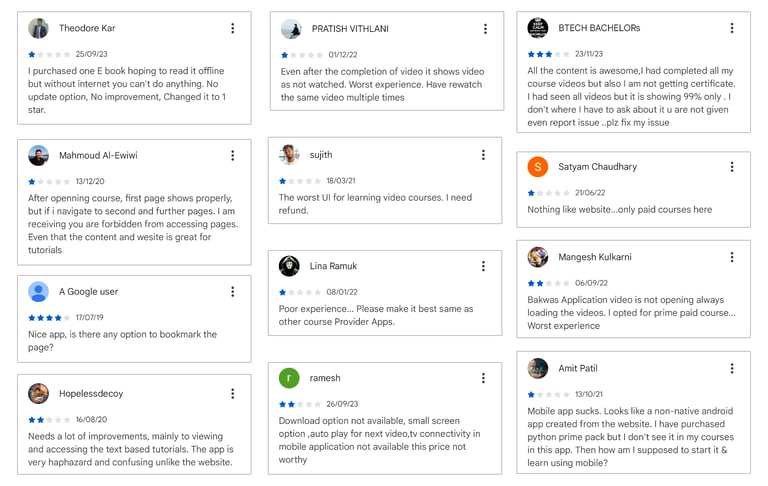
3. Research
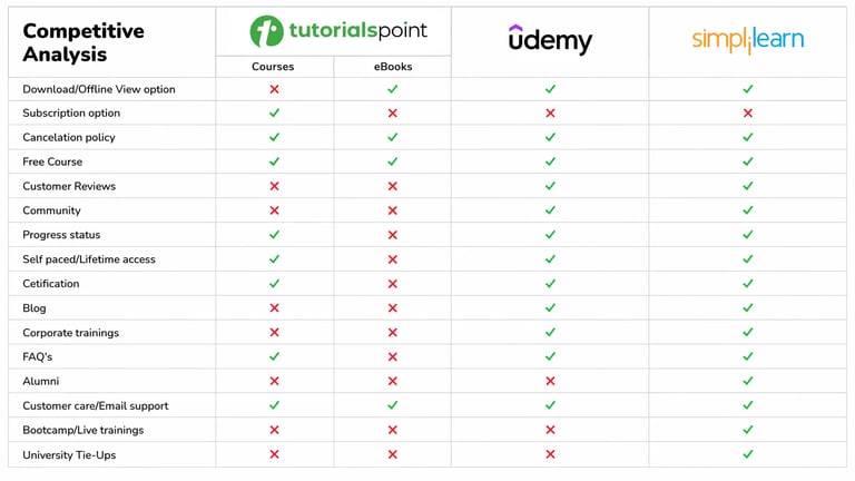
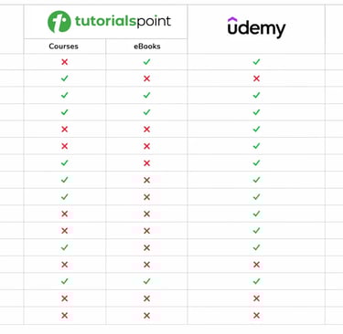
Analyzed user reviews and benchmarked leading learning platforms to identify usability gaps and opportunities.
Key Takeaways:
Poor discovery leads to drop-offs
Lack of continuity reduces long-term engagement
Competitors prioritize structured navigation & progress tracking
The gap was not in content, but in usability and experience.
4. Plotting Insights
Users search with intent, not browse
Failure in discovery leads to churn
Learning breaks without progress tracking
Mobile experience must feel fast, intuitive, and native
Users valued access and continuity more than individual purchases.
5. Strategy
Focused on improving the experience across three core areas:
Discovery – Enable faster and more relevant content search
Continuity – Support progress tracking and seamless learning
Clarity – Simplify navigation and content structure
Explored opportunities to improve both user experience and business value.
7. Outcome
Reduced friction in content discovery and navigation
Improved learning continuity through progress tracking
Introduced a subscription model supporting recurring revenue
Designed a scalable structure for future growth
Balanced user experience improvements with business goals.
8. What I’d Do Today
Introduce AI-driven personalized recommendations
Validate decisions through usability testing
Design for offline-first learning
9. Learnings
Prioritized problem definition over visual design
Improved ability to structure complex platforms
Strengthened product and business thinking
6. Solutions
Search Experience
Users struggled to find relevant content quickly
Introduced search suggestions, recent searches, and filters
Improved relevance and reduced effort in discovery
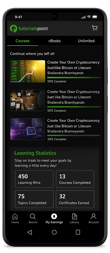
Learning Dashboard
Users had no way to resume learning
Designed a “Continue Learning” system with progress tracking
Enabled seamless continuation across courses
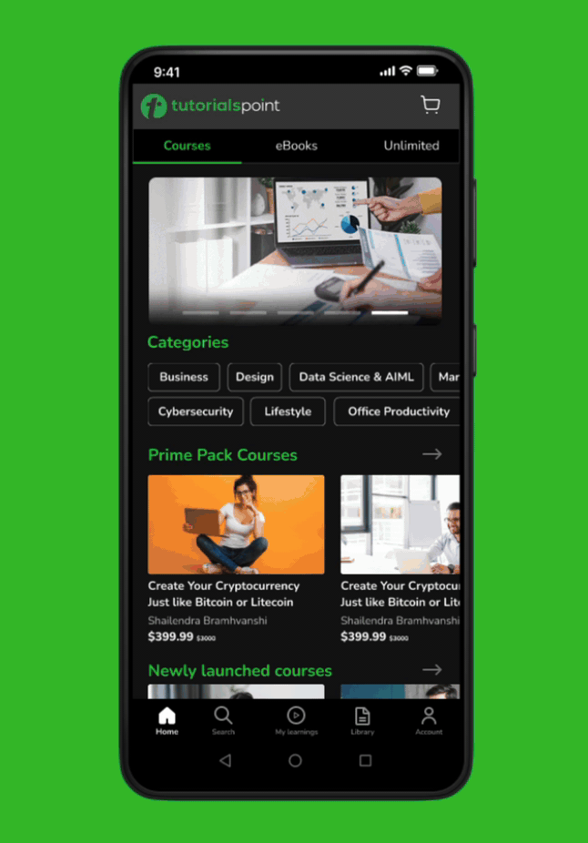
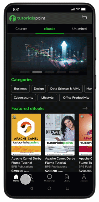
Content Structure
Content was fragmented across courses and eBooks
Created clear separation and hierarchy
Improved readability and navigation
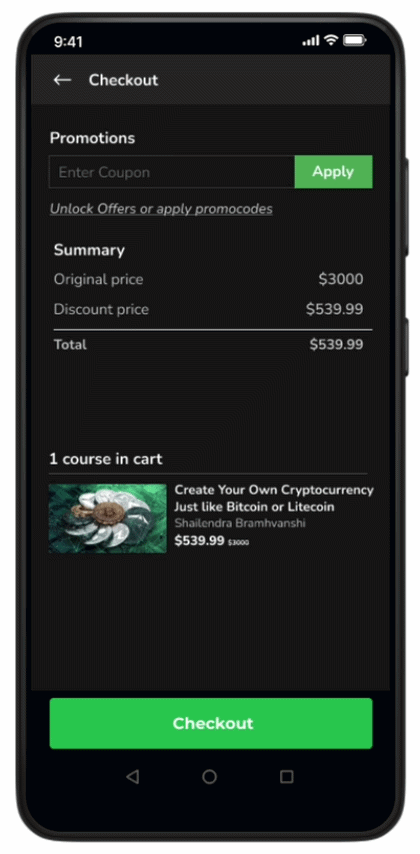
Checkout Flow
Purchase flow lacked clarity and transparency
Simplified pricing, coupon application, and order summary
Reduced friction in decision-making
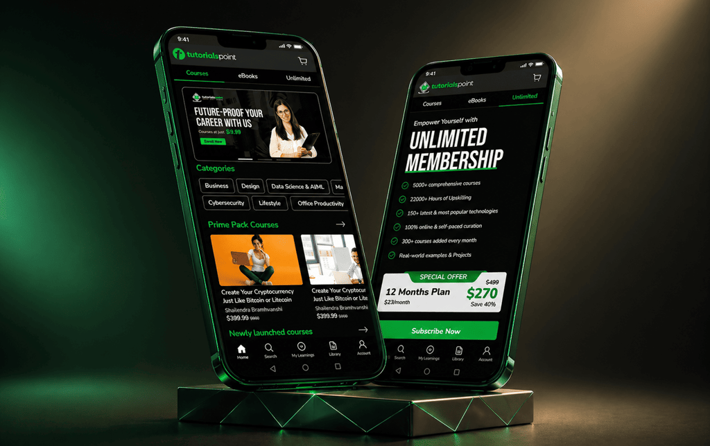
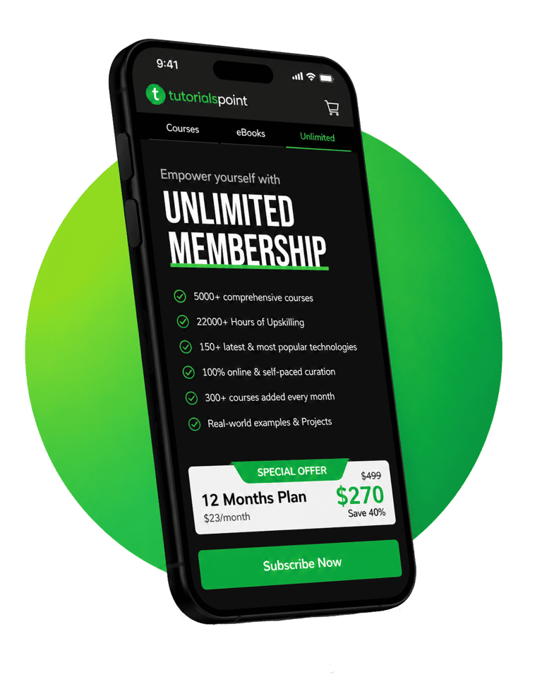
Subscription Model. (Unlimited Membership).
One-time purchases limited long-term engagement
Introduced a yearly “Unlimited Membership” model
Simplified access to all courses and eBooks
Designed clear value communication to highlight cost benefits
Reduced decision friction and encouraged commitment.
Shifted the product towards a scalable, recurring revenue model.

Designed with a strong focus on usability, hierarchy, and intuitive user experience.
The project highlights structured problem-solving, product thinking, and modern interface design principles.
Additional opportunities for refinement and future enhancements were identified within the project scope.
Design that speaks. Experiences that convert.
© 2026 Pranav Designs - Crafted for clarity
Let’s collaborate → hello@pranavdesigns.com