Write your text here...
1. Overview
Project Type: Website Redesign
Platform: Responsive Web (Desktop + Mobile)
Timeline: 4 Weeks
Role: UX/UI Designer
Tools : Adobe XD, Photoshop
Redesigning a student accommodation platform to improve discovery, trust, and decision-making.
2. Problem Statement
Students struggled to efficiently discover, compare, and trust accommodation options, leading to slower decision-making and friction in the booking journey.
Overloaded interface with poor visual hierarchy
Difficult property comparison experience
Lack of clarity in pricing and amenities
Weak search and filtering system
Outdated UI that didn’t reflect credibility
This resulted in users feeling overwhelmed instead of confident while choosing accommodation.
3. Research & Key Insights
Users scan, not read
→ Important details must be instantly visibleComparison drives decisions
→ Users evaluate multiple listings before committingTrust is a deciding factor
→ Ratings, reviews, and clarity influence choices
4. Design Principles
Prioritizing clarity over density
Enabling faster comparison between listings
Surfacing trust signals early
Reducing cognitive load across the journey
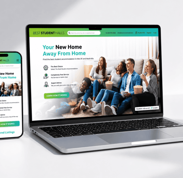
Click on the images to enlarge
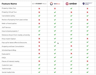
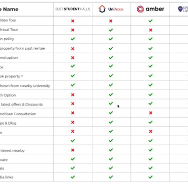
Competitive Analysis
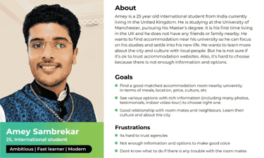
User Persona
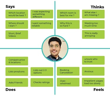
Empathy Mapping
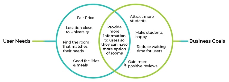
Analysis
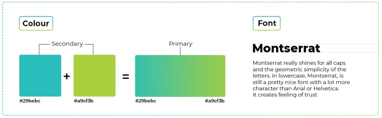
Branding & Typography
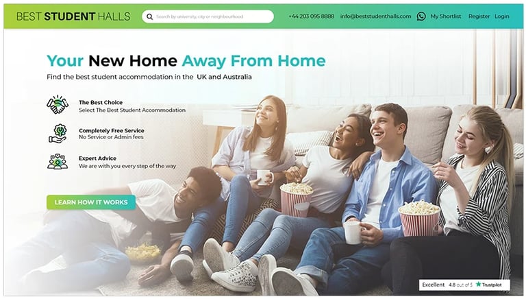
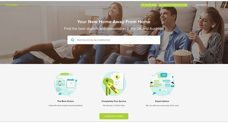
Old vs New website
Old Website
Logo and header blend into the background; hard to read
Three key points cluttered with bulky vector shapes
Dull, outdated look that undermines trust
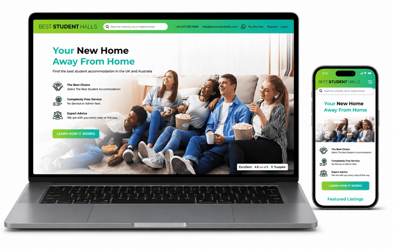
New Website
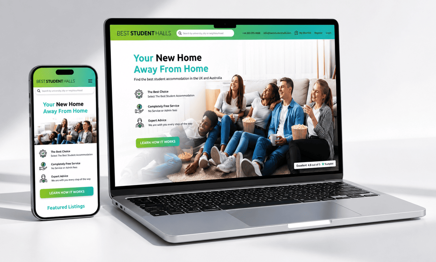
Gradient theme and consistent styling — modern and credible
Redesigned header with universal search bar
WhatsApp icon added for instant chat
Clear, readable content and layout
Three key points highlighted with consistent icons
Trustpilot/reviews section added
Brighter image tone for a fresh look
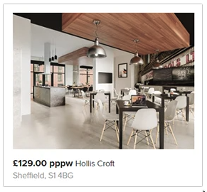
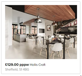
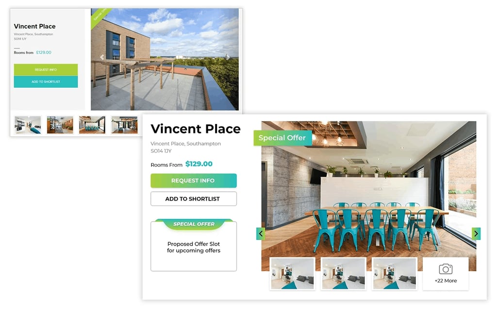
Old Featured Listing
Only shows an image
Missing key info & actions
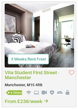
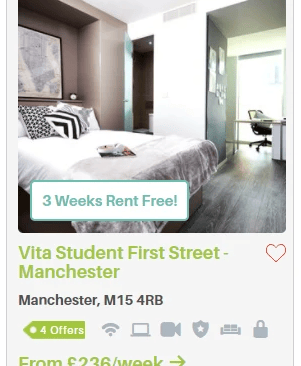
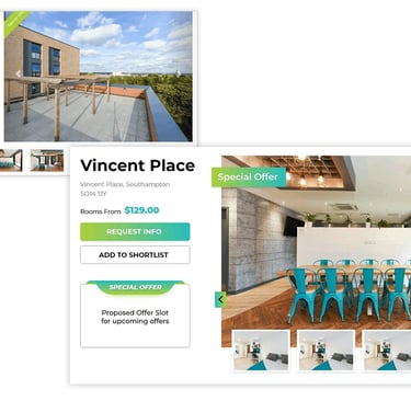
New Featured Listing
New layout and orientation
Wishlist option added
Price shown per week
Offer slot included
Facility icons added
New Property page
Newly designed page as per new theme
Provided offer slot
Old Property page
Looks incomplete
Offer section missing

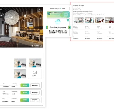
Old Property section
Facilities are shown in paragraph
Enquiry & Book both buttons are highlighted, creating confusion which one is primary and secondary
Limited number of photos
Top right section of the container is empty
New Property section
Added room tour video
Containers with options to show more photos
Clear CTA hierarchy (Primary: Book, Secondary: Enquire)
Structured layout with icon-based information
Integrated offer section
Optimized layout for better content visibility
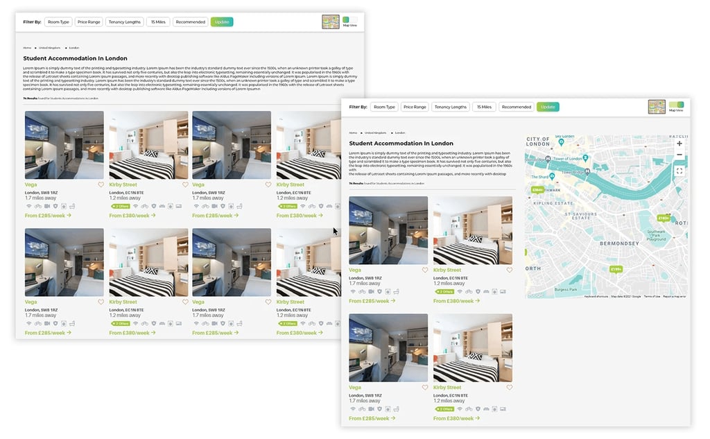
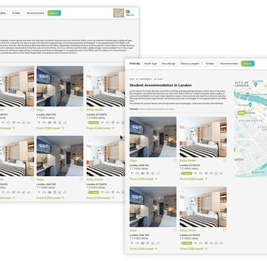
City Search Page
Introduced a Map View to enable quick, location-based exploration of nearby properties.
6. Key Improvements
Simplified Navigation
Reduced clutter
Better hierarchy
Strong Visual Hierarchy
Important information highlighted first
Clean spacing and typography
Improved Property Cards
Key details visible at a glance
Pricing, location, and ratings prioritized
Smart Filtering System
Easy-to-use filters
Faster decision-making
Trust Building Elements
Ratings, reviews, and verified badges
Professional and modern UI
5. Visual Design
Minimal and modern aesthetic
Clean typography
Consistent spacing system
The goal was to make the experience feel simple, premium, and reliable.
7. Impact
Reduced time to find suitable accommodation
Improved clarity in decision-making
Increased user confidence through transparency
9. Reflection
This project focused on transforming a cluttered experience into a clean, intuitive, and user-centered platform. The redesign prioritizes clarity, trust, and usability, making it easier for students to find and book accommodation with confidence.
“These changes were aimed at reducing decision friction and improving booking confidence, especially for first-time student renters.”
Project designed in 2021; core UX principles like hierarchy, clarity, and usability remain relevant even till date.
Design decisions were made with limited data and without live user validation, with scope for future testing and refinement.
Some solutions were not implemented due to project constraints at the time.
8. If I revisited this today
Leverage AI to surface personalized and context-aware accommodation options
Use data and testing to continuously optimize the booking experience

Design that speaks. Experiences that convert.
© 2026 Pranav Designs - Crafted for clarity
Let’s collaborate → hello@pranavdesigns.com